Redesigning a B2B brand intelligence platform used by C-level execs at Fortune 500s
BERA, New York
BERA had product-market fit but a product built only by engineers — Fortune 500 brand and finance leaders found it powerful but unusable without a CSM walkthrough.
Over 15 months as the sole designer, I helped with a full platform redesign across 6 product surfaces, shipped in 4 releases. After delivery, BERA's internal team had enough product runway to operate without external design support for 12+ months.
Role
Sr Product Designer
Client Stage
Round A
Date
2021 — 2022
The problem
BERA's customers were C-level brand and finance leaders at Fortune 500 companies — Coca-Cola, Nike, Pepsi were all on the list.
They paid real money for the analytics. But the product had been built by engineers without a designer, and it showed. New customers needed a scheduled walkthrough with Sales before they could find any value. Existing customers got their insights mostly through CSMs instead of logging in themselves.
The product had won contracts on the strength of its data. But the data wasn't legible without a translator.
On data 📊
BERA had no usage analytics in place when I started. My problem framing came from interviews with both BERA PMs, the head of CS, reviewing categorized support tickets, and user interviews with real customers.
Decision 1
Restructure around user jobs, not feature parity
The product had grown messy — every customer request became a new feature in a new place. The obvious plan was to redesign every screen 1:1.
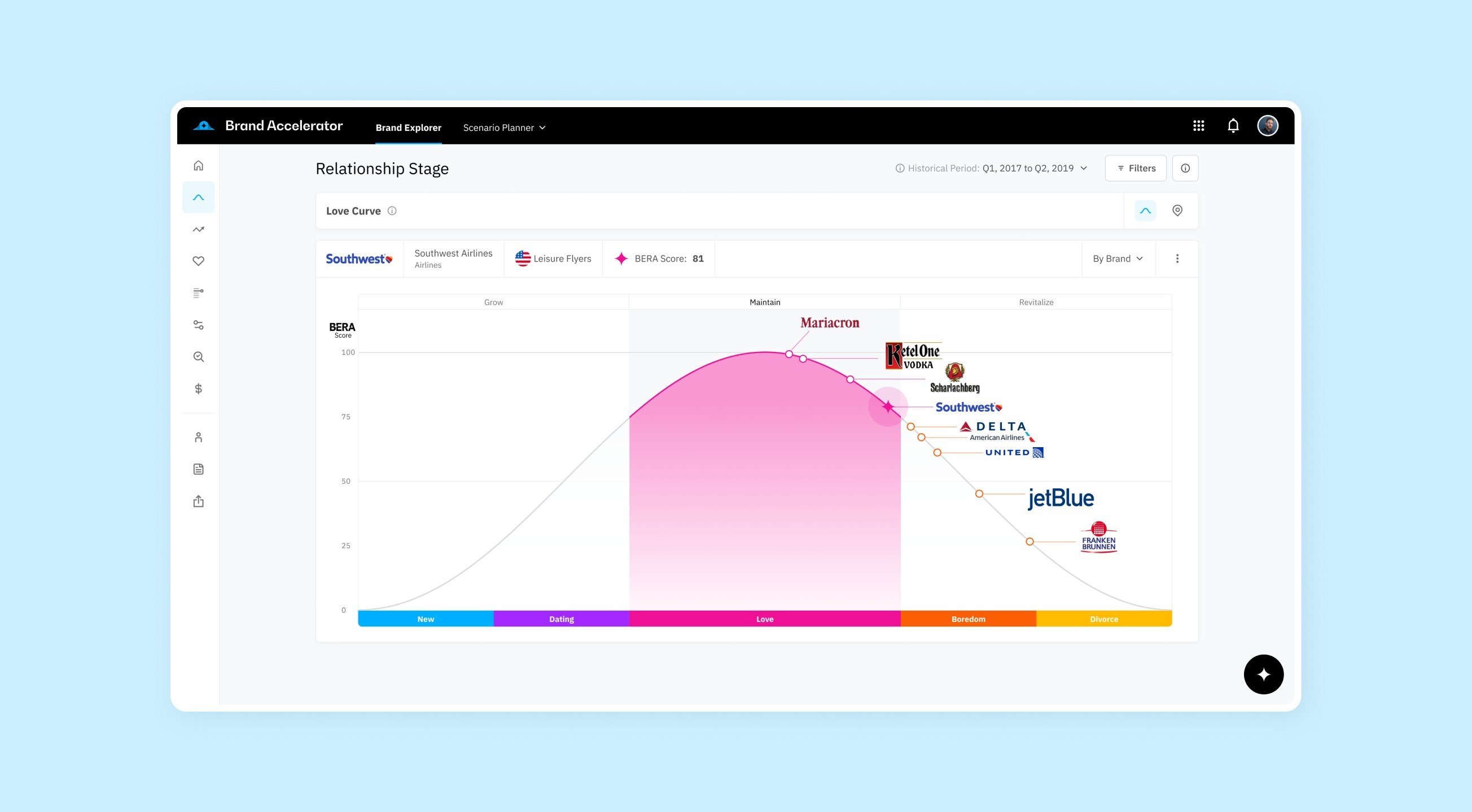
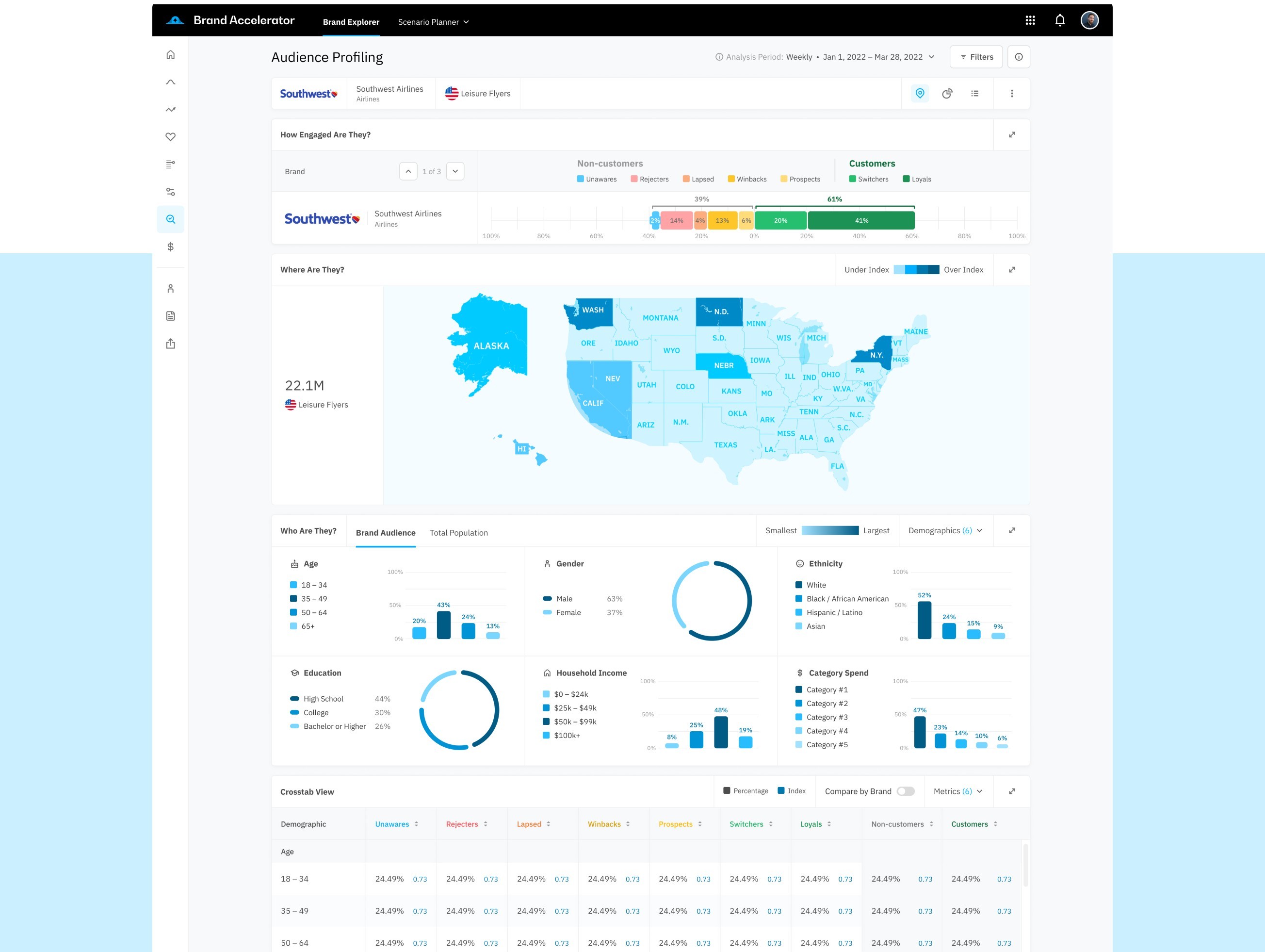
I pushed back and proposed three jobs to structure the product around: "see how my brand is performing", "compare against competitors", "predict the financial impact of brand decisions". Existing features got mapped into those jobs. A few got cut — nobody used them.
Tradeoff: 6 weeks added upfront, plus a hard conversation with PMs about cutting features customers had asked for. But the alternative was a prettier version of the same broken product.
Decision 2
Onboarding as a teaching layer inside the product
We built an onboarding stepper, and the team decided this was where onboarding ended. But it was only account setup, not user activation. BERA's value only clicked once you were inside a real analysis with real data — a tour wouldn't fix that.
So, I designed educational UI into the actual surfaces. Empty states explained how to read a chart on the chart itself. Tooltips defined terminology inline. A "your first analysis" path used the user's own brand data on first login. Animations or videos with demo data.
Tradeoff: more surface area to design and maintain. But the stepper would have given users a tour they'd forget by the time they hit the dashboard. Sales spent less time onboarding new customers as a result.
Constraints I designed around
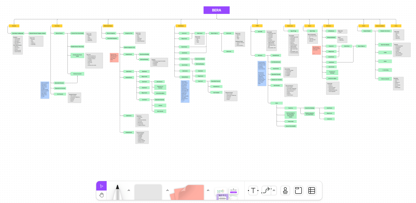
The BERA system was huge.
So big that even a product manager with 5 years of experience didn't know everything about it. Sometimes this slowed us down.No usage analytics existed.
We couldn't tell which features mattered. I built a feature inventory by walking through every screen with each PM, asking "who uses this and how do you know?". Half of them had no answer. Those became candidates for removal.Designs went into development 6–12 months later.
Direct dev feedback was thin. I worked around this by holding weekly feasibility reviews with the lead engineer specifically on architecture-affecting decisions.Users were unreachable.
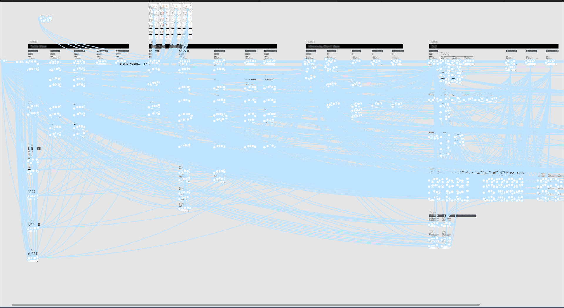
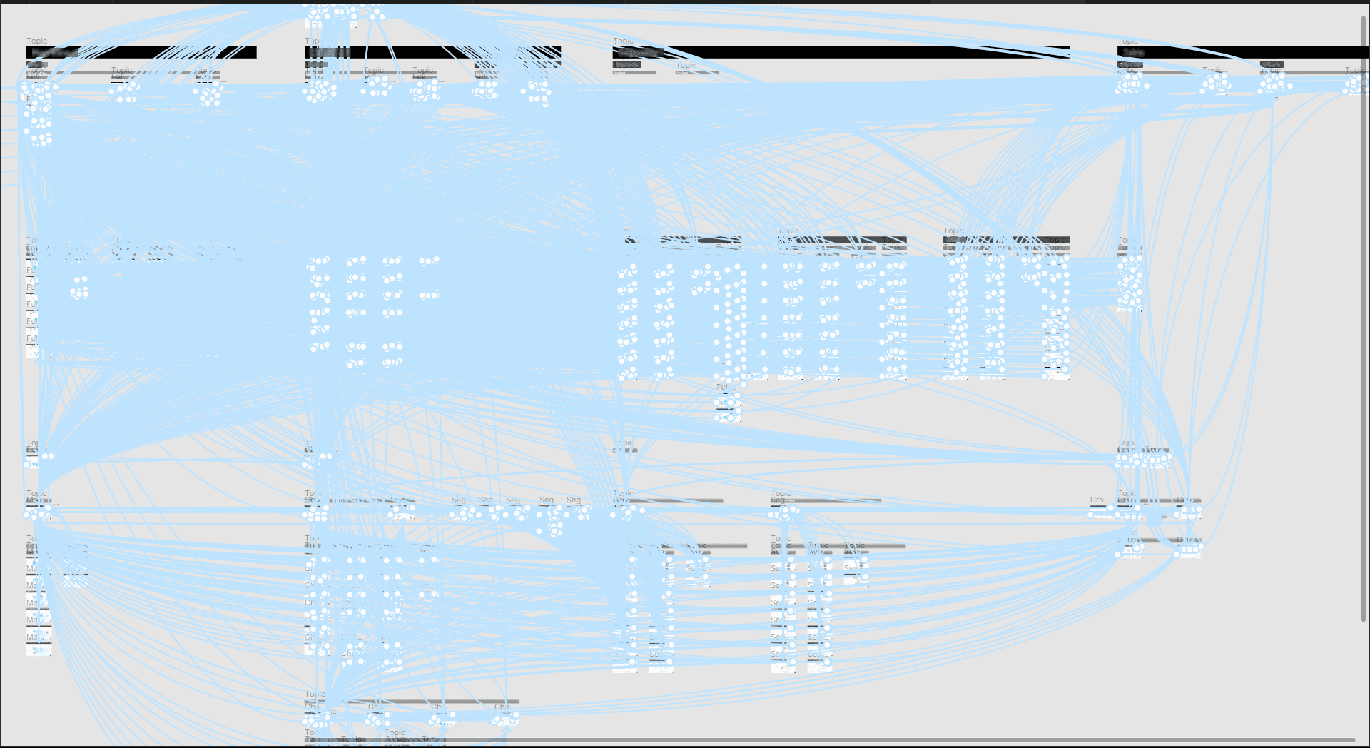
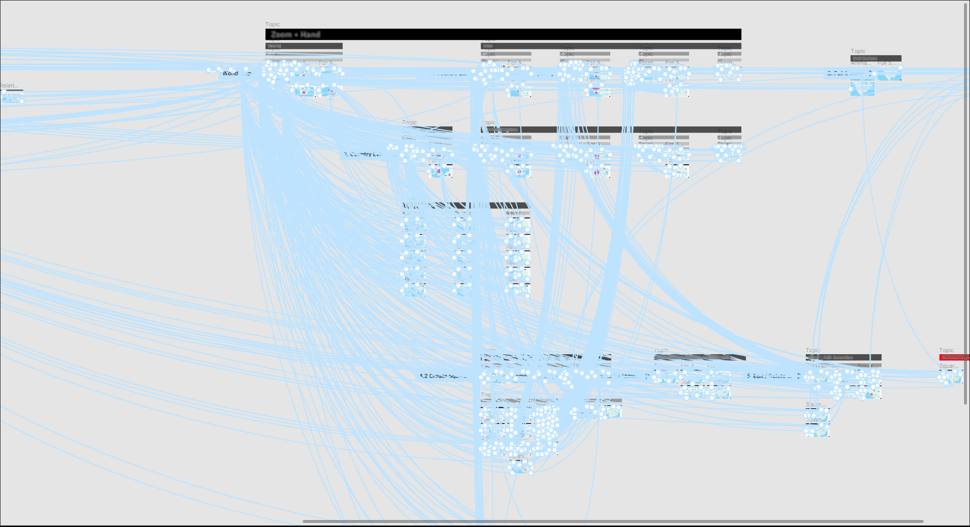
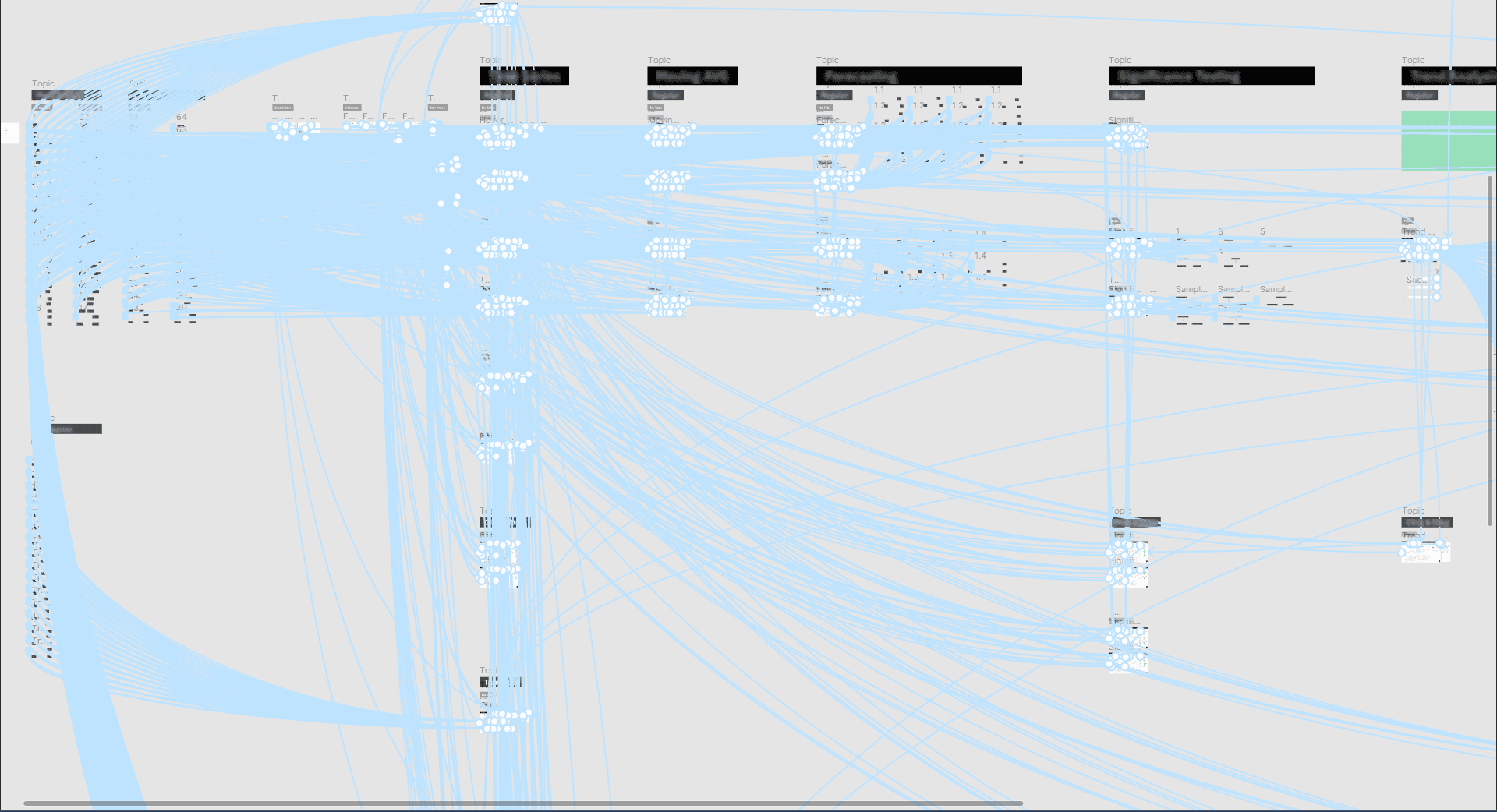
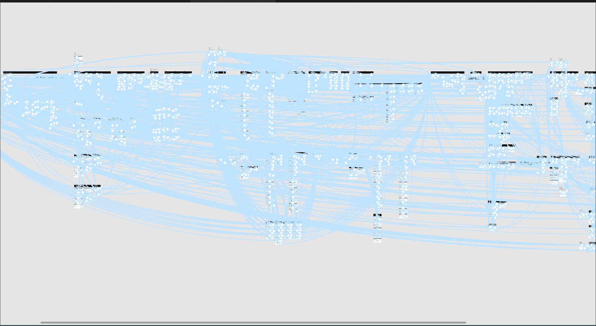
C-level execs at Fortune 500s aren't available for casual usability tests. When we did get a session, we tested clickable prototypes covering as many features as possible. As a result, the prototypes were sometimes quite large:
Okay, but what about the results?
Redesigned whole platform → Now it’s simpler to use → Increased conversions
Created new Onboarding. Sales team reported running fewer scheduled walkthroughs for new customer setup
Created education in the UI → Reduced the load on Customer Support
Now users get to Aha moment faster → Increased conversion & retention
After delivery, BERA's internal team operated without external design support for the next 12+ months

What I'd do differently
Push for usage analytics on day one.
Without baseline data, every impact story I could tell after delivery was qualitative. Honest, but harder to defend.Treat mobile / tablet as optional, not equal.
The brief said adapt for all screens. In practice, C-level execs almost exclusively used desktop. That work could have been deprioritized in favor of more depth on the core analytics surface.
