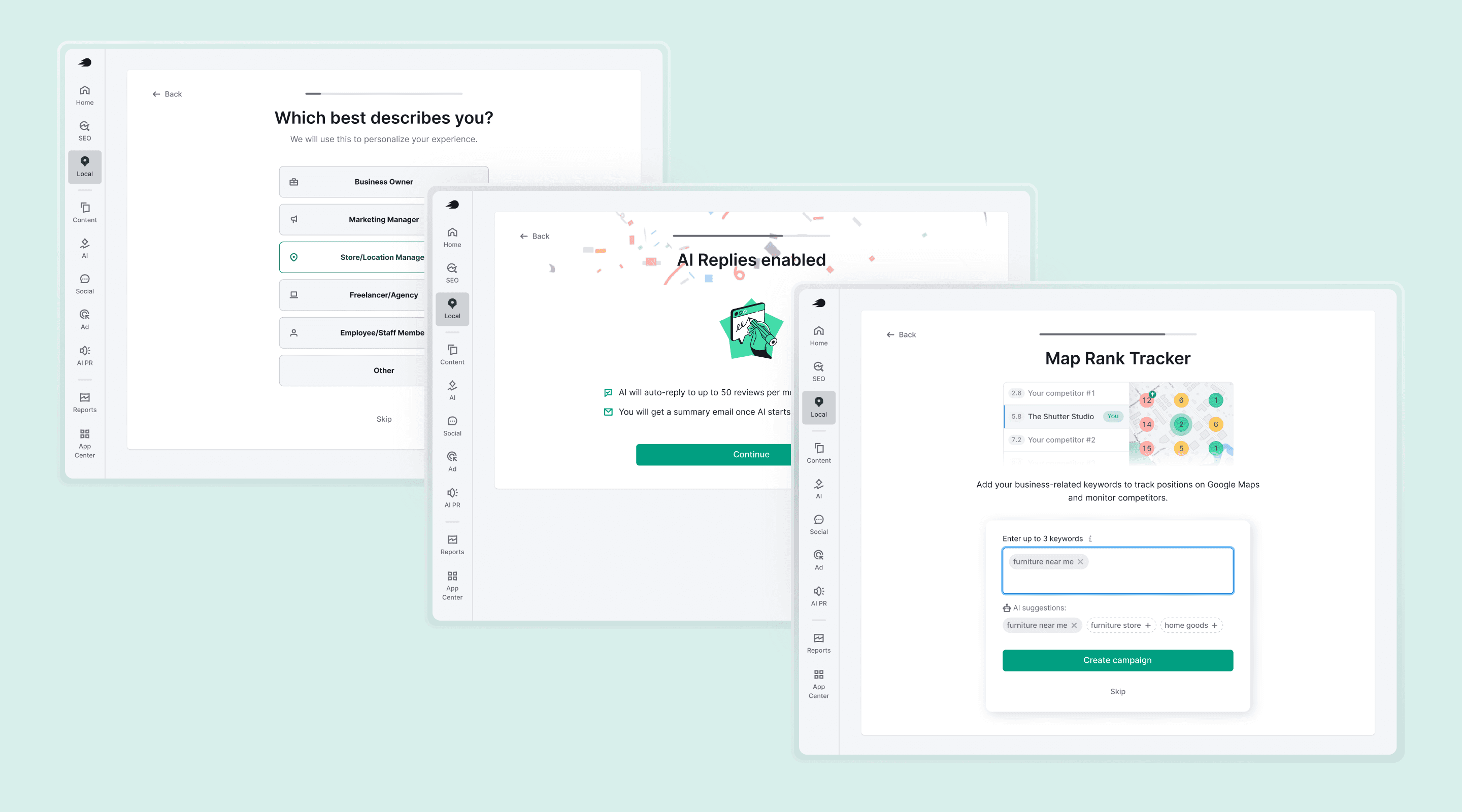
AI Replies
Semrush Local
Listen case by Alex (11:47)
Reply rate for SMB owners went from 35% to 68% over the year after launch.
46% of users turn AI Replies on during onboarding; another 7% within their first three days.
92% of users who activate keep it on.
Median response time dropped from 6 days to a couple of hours.
Became the foundation for the team's next product, the GBP AI Agent.
Half of weekly active users on Semrush Local now use AI Replies. One of the highest-retention features the team has shipped.
Role
Product Designer
Team
1 PM, 4 backend, 2 frontend, 2 QA
Date
2024 — 2026
Content
Local and the user
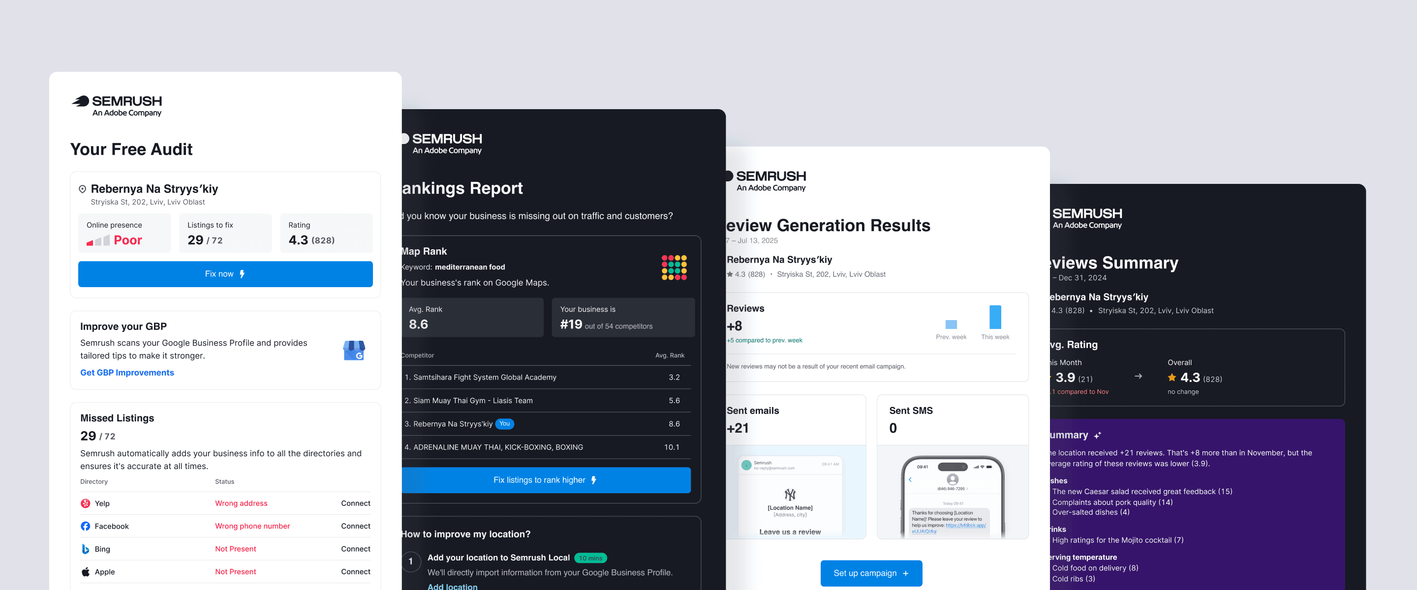
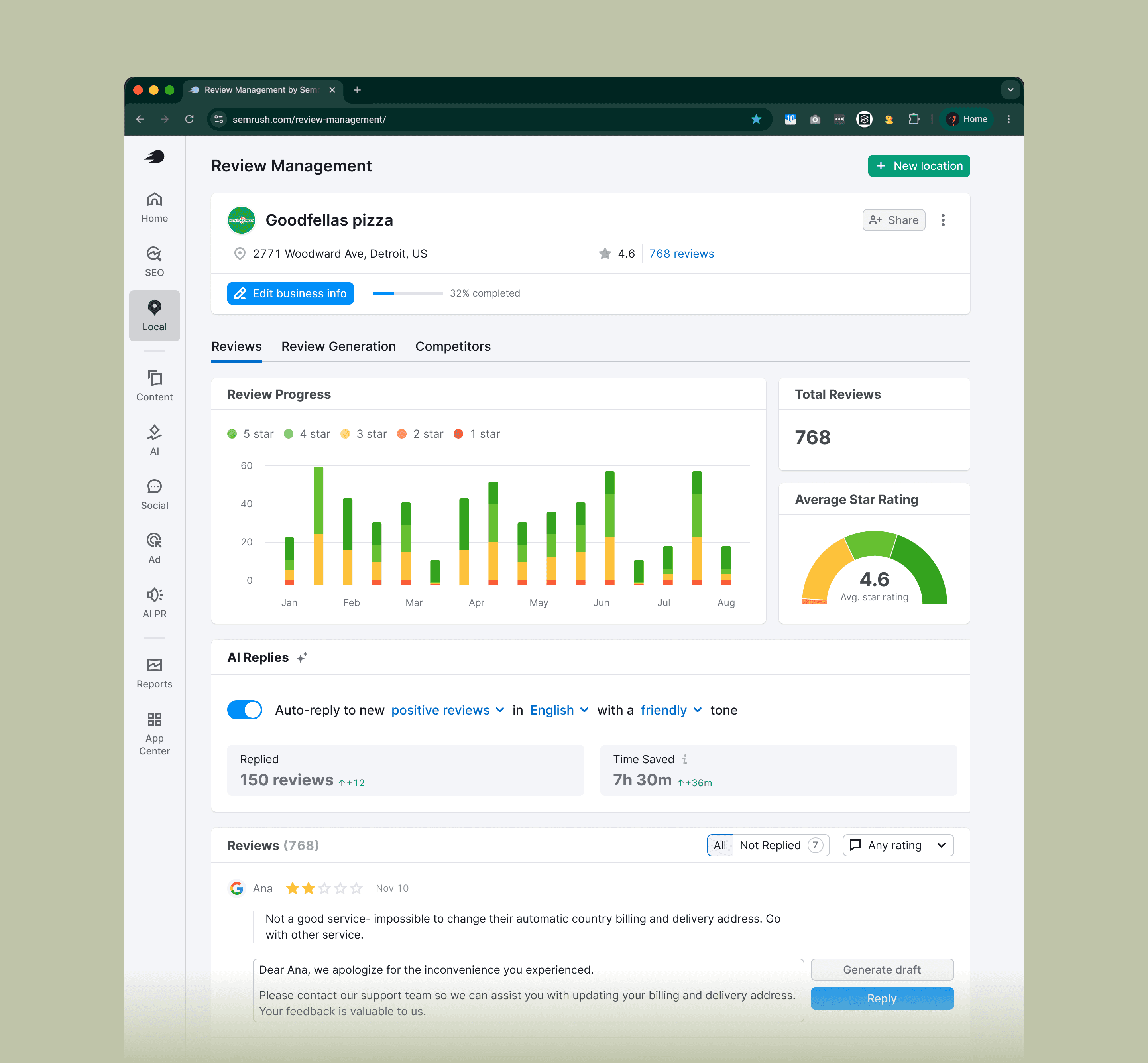
Semrush Local manages how businesses appear on Google Maps. Review Management pulls reviews from a business's locations into a single inbox where owners can reply.
Our primary user: businesses with two to ten locations without a dedicated person handling reviews. Local SEO agencies were a strong second group. Enterprise was a distant third.
The problem
Reviews are SEO. Google rewards locations that respond to their reviews, positive and negative. It quietly punishes the ones that don't. For our users, replying was the task they kept postponing.
Median time to respond was six days 📆
A four-star review left on Wednesday got a reply the following Tuesday. The customer had moved on. Google's ranking had noticed.
3–5 star reviews were almost never answered ❌
They didn't feel urgent, so they piled up. Highest-volume bucket, biggest SEO hit.
Negative reviews paralyzed owners 😪
They knew they should respond. They didn't know how. So they often didn't.

Before AI Replies, there was AI Drafts
We didn't start with full automation. The first version of AI here was AI Drafts. The model generated a reply, dropped it into the input field, and the user edited and posted.
AI Drafts worked. People used it. But it didn't solve the real problem. The work was still manual. Six days became four, not two hours.
The metrics weren't the headline. What mattered was the shift in user perception. After using AI Drafts a few times and seeing the output was usually fine, users became willing to let the model post directly.
AI Drafts was the trust ladder for AI Replies. You don't ask someone to hand their customer-facing voice to a model on day one. You let them try the safer thing first. When a user posted five or more AI drafts with little or no editing, a nudge appeared: "You're already letting AI do most of the work. Try AI Replies and skip the click".
For new users who hadn't seen AI Drafts, onboarding had to compress the same ladder into a single screen.
Design decisions
1. Radical simplicity, in a product not known for it
Semrush is known for dense interfaces. SEO professionals can handle that. A bakery owner with three locations can't handle that.
The rule I set: a 65-year-old store owner has to understand the entire feature on first read.
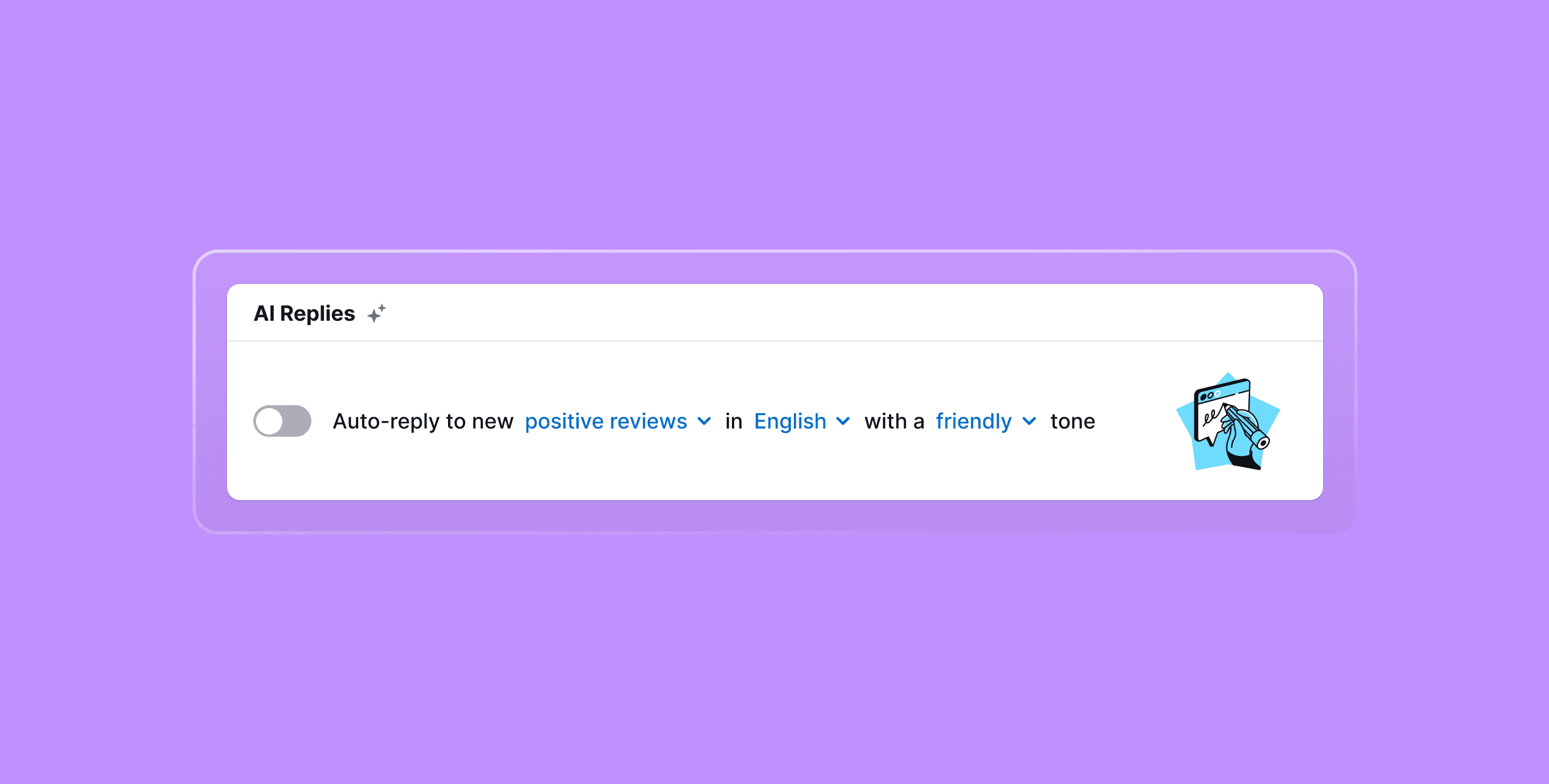
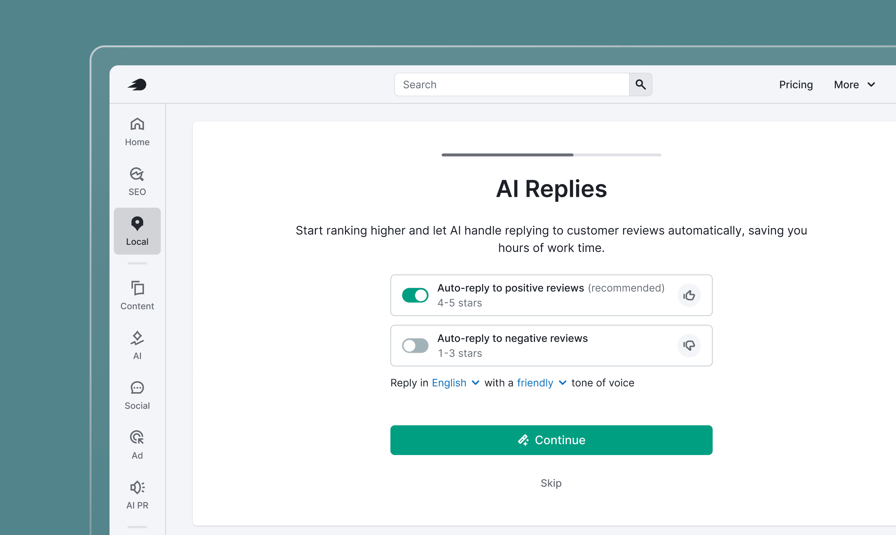
Everything was stripped to one sentence with three configurable phrases:
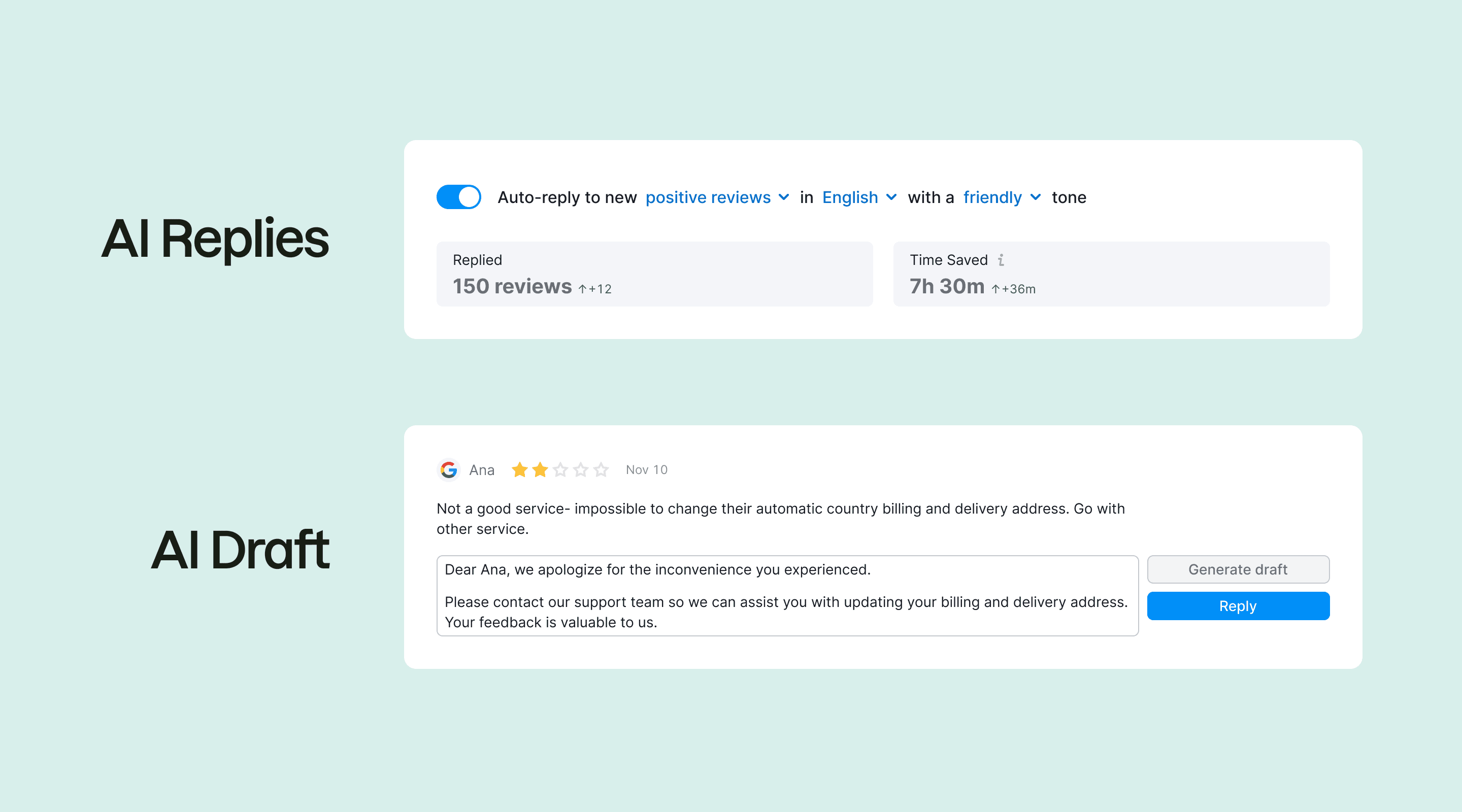
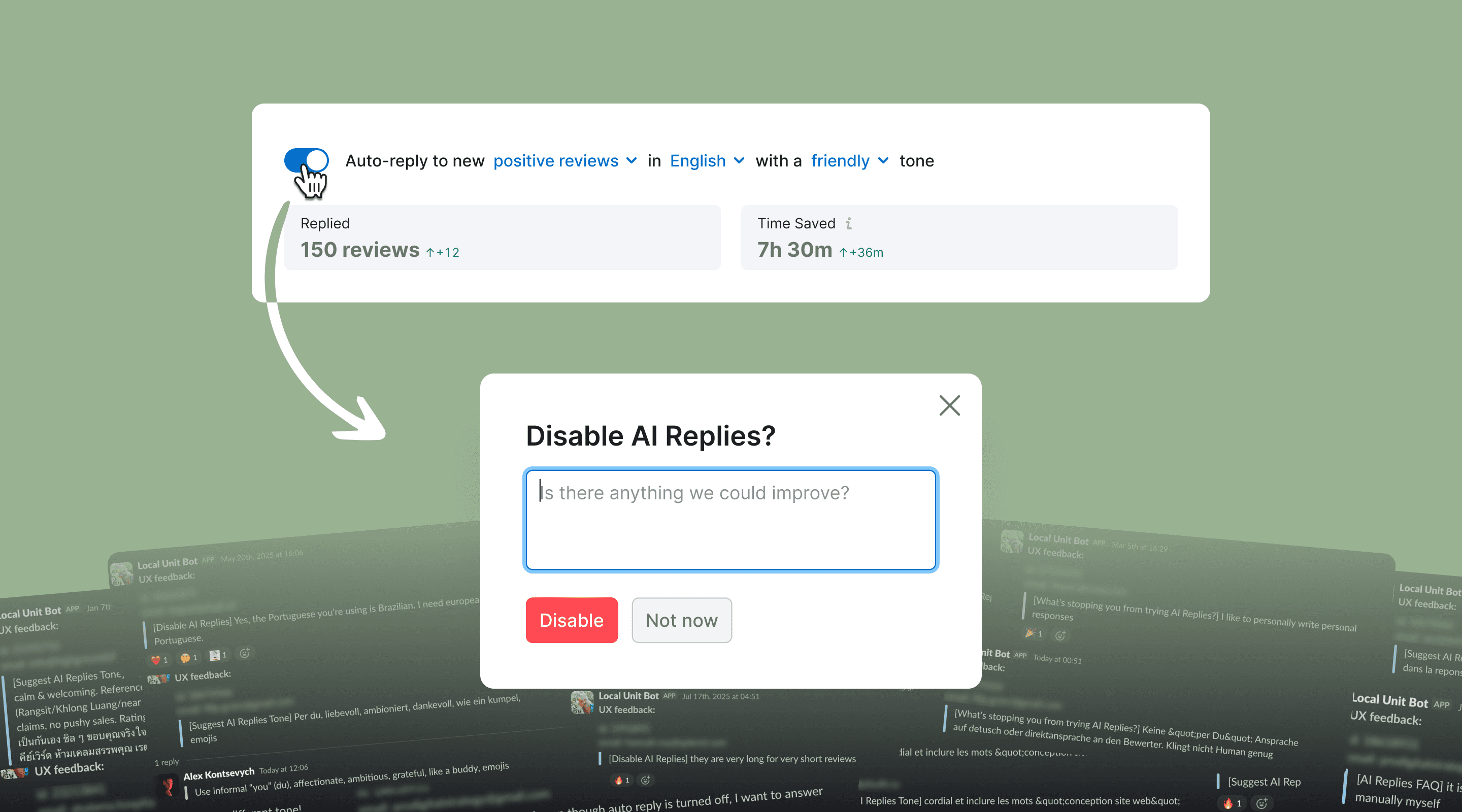
Auto-reply to new positive reviews in English with a friendly tone.
One toggle. The configuration that other Semrush features render as a table of checkboxes is just a sentence. The hardest part wasn't writing the sentence. It was resisting the pressure to add controls.
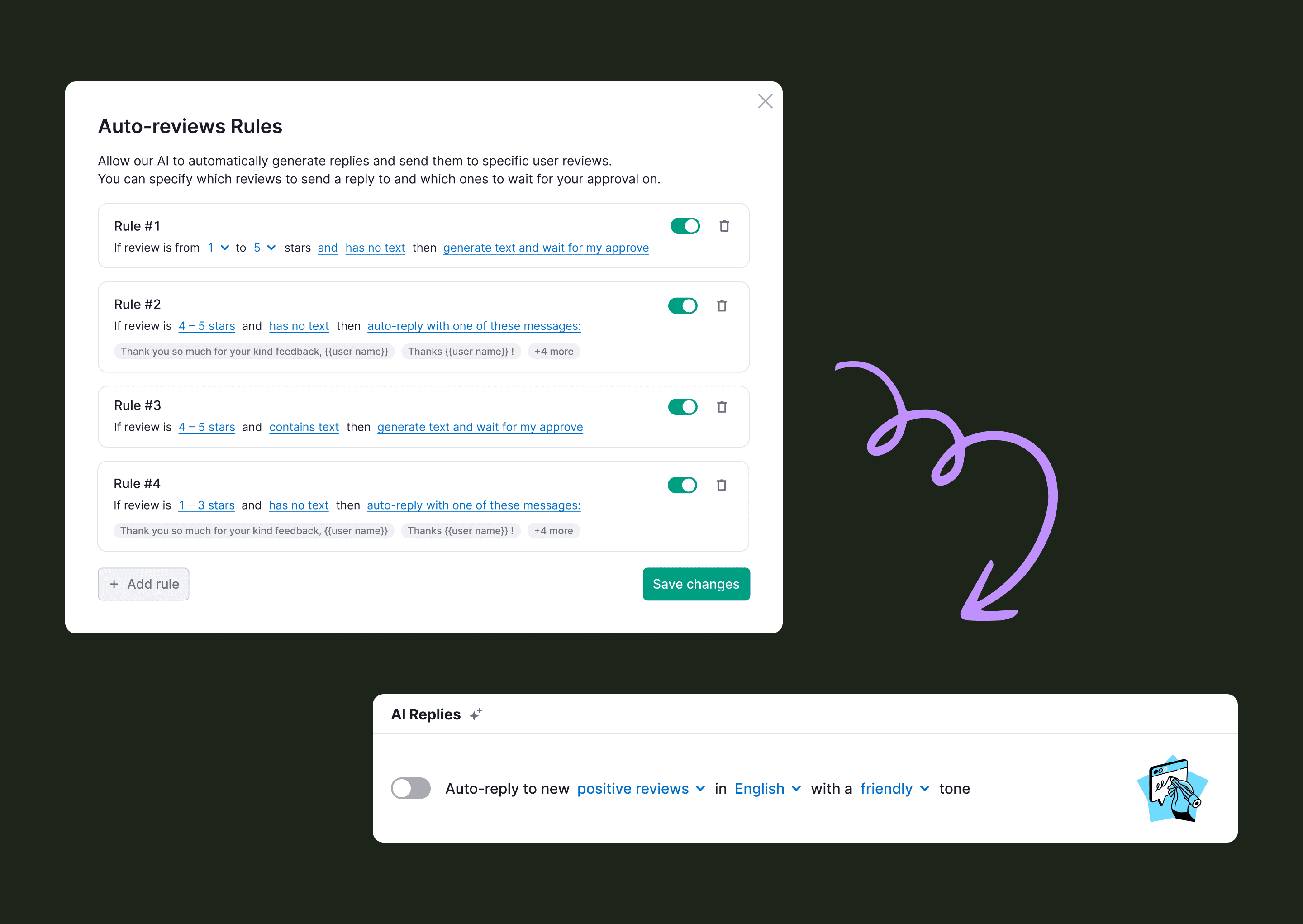
2. Default ON for positive, OFF for negative
We considered three activation models: auto-enable in the background, a single toggle for all reviews, and separated toggles by sentiment. We tested the first two. Both killed activation. Auto-enable was at least 2x worse: users felt something had been switched on without consent. A single toggle for both categories didn't survive either, since users wouldn't hand off positive and negative reviews on day one.
So: two toggles, positive and negative, separated.
Positive on by default. Negative off.
Users wanted to start with the safer option. See that AI handled positive reviews well, then turn on negative replies. The product had to mirror that ladder, not flatten it.
After activation, users hit a confetti screen: AI Replies enabled. A dopamine moment, then onward through the rest of onboarding.
3. Trust architecture
Users' core anxiety wasn't about whether AI would work. They worried it would embarrass them. The trust architecture had to address what happens after activation. Three patterns carried this:
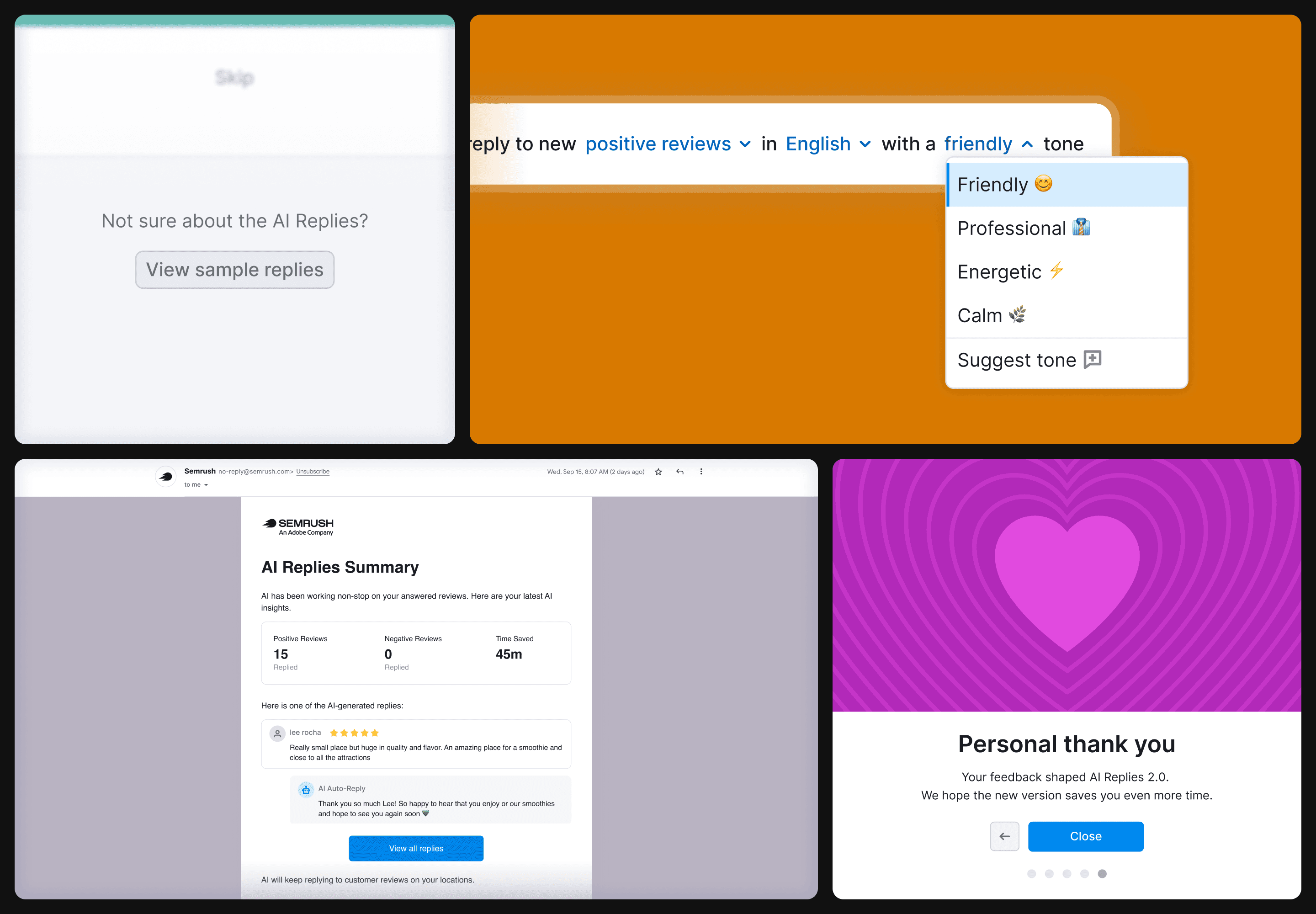
Preview before commit 👀
During onboarding, users could browse sample reviews and see how AI would reply. They got a feel for tone, length, and quality before flipping the toggle. This single affordance moved activation visibly.
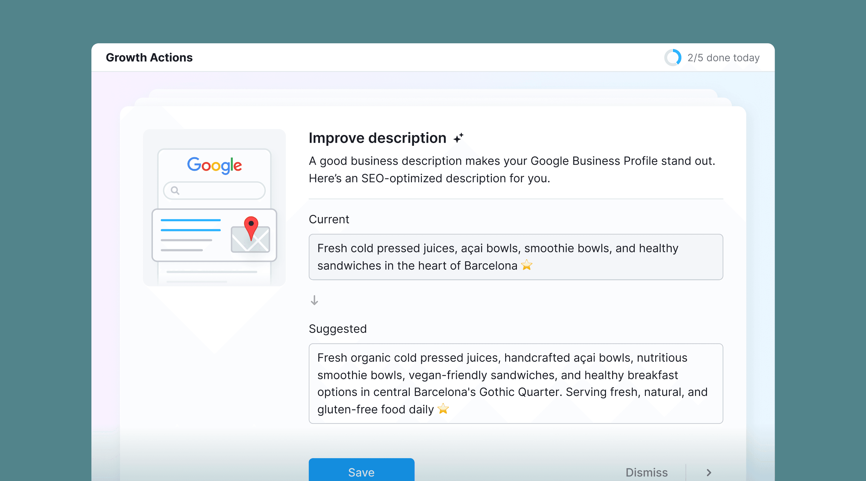
Tone customization ⚙️
The first release shipped without it. The most common complaint was that replies felt "AI-ish". I researched how users talk to their customers and added tone presets in v2: friendly, professional, calm, etc. One of the highest-impact additions of the entire project.
Post-fact email summary 📩
After AI sent its first batch of replies, users got an email digest: replies sent, one example, time saved, and links to edit anything. Leading with time saved (in minutes or hours) instead of reply counts turned AI activity into something users cared about.
4. Model-aware decisions
A few decisions came from understanding what the model was good and bad at, not from generic UX:
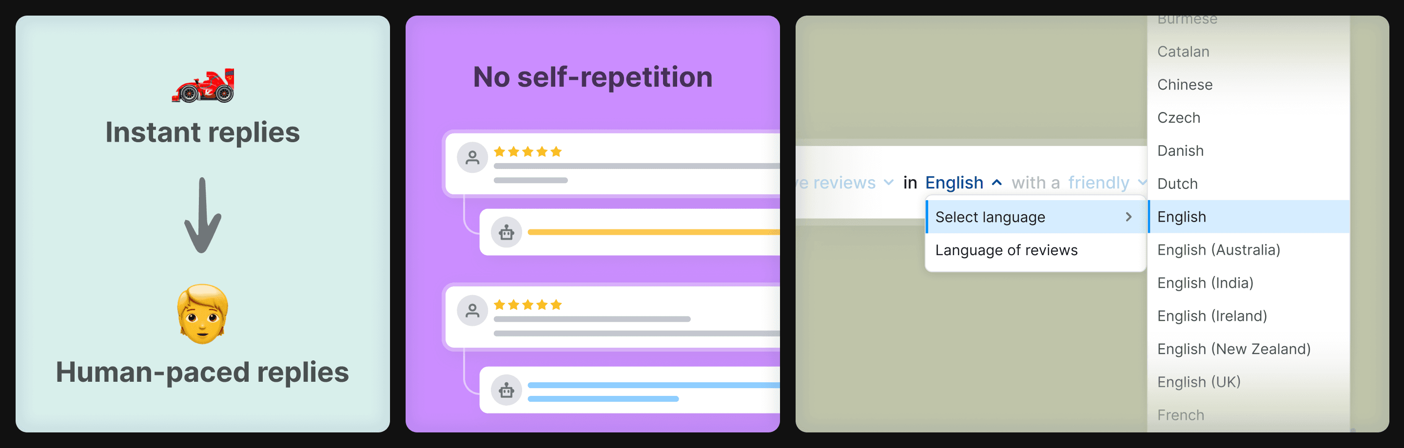
Throttled timing ⏱️
AI could reply within seconds. We slowed it to a couple of hours. Instant replies felt unnatural and made users less trusting. They wanted it to feel like a human stepping in.
Self-repetition fix 🔁
The model reused phrasing across reviews. Same opening, same closing, same emoji. We passed the business's previous AI replies into the prompt context. Output diversified immediately.
Language coverage 🌍
A Spanish business getting a Chinese review and an Italian AI reply was a real pattern. We added ~130 selectable language and dialect options. Each is one word in the system prompt, but a meaningful surface of control for non-English markets.
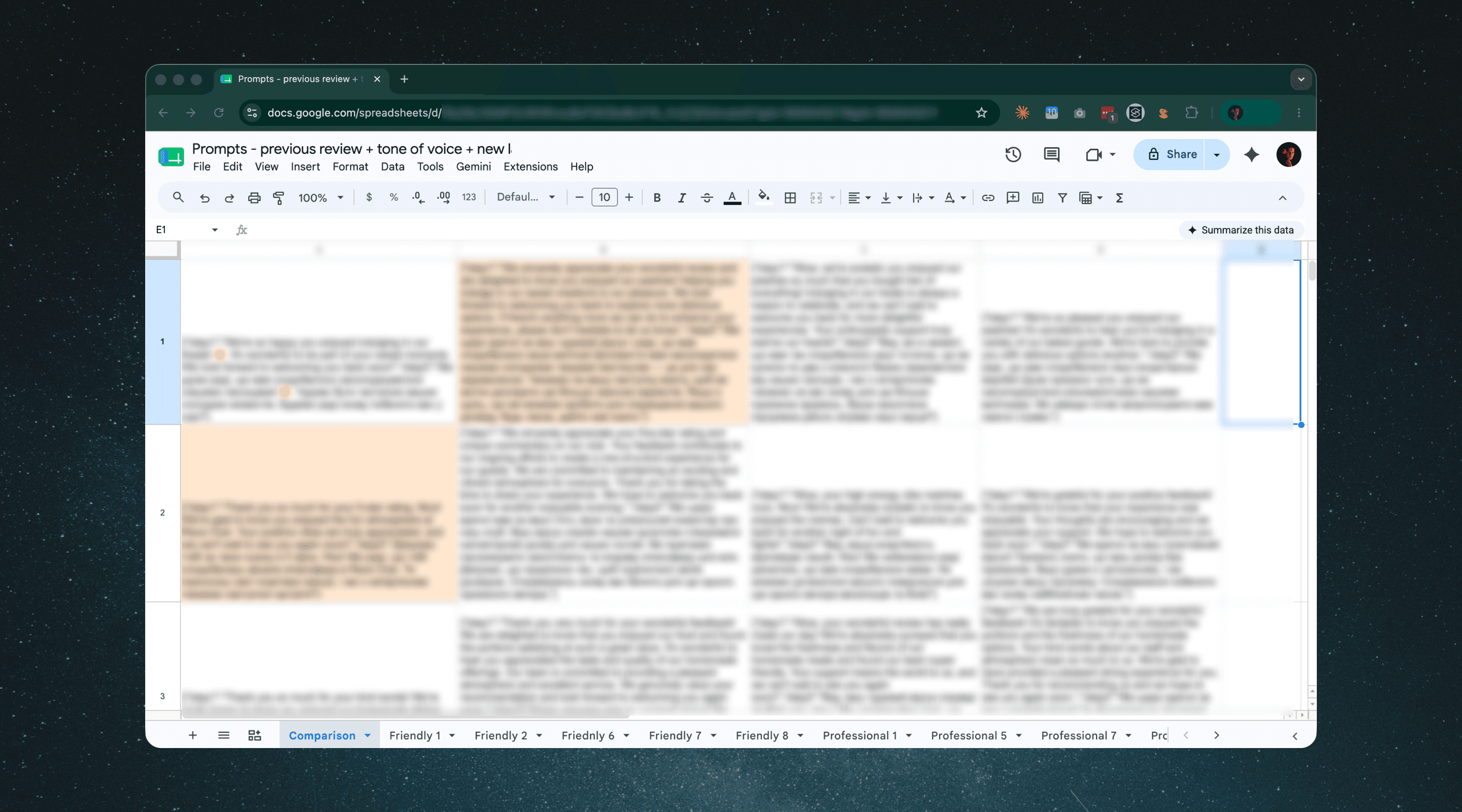
5. The prompt is part of the design
I owned prompts directly with the backend engineers. They wrote first drafts. I reviewed output qualitatively against the design intent and proposed improvements:
Tuning for more natural-feeling replies;
Sharpening the model's context comprehension on edge-case reviews;
Keeping prompts compact enough that token costs stayed sustainable as the feature scaled.
Nothing went to production or QA without that loop. Treating the prompt as a design surface (its cost and density, not only its phrasing) kept output quality close to what the UI promised.
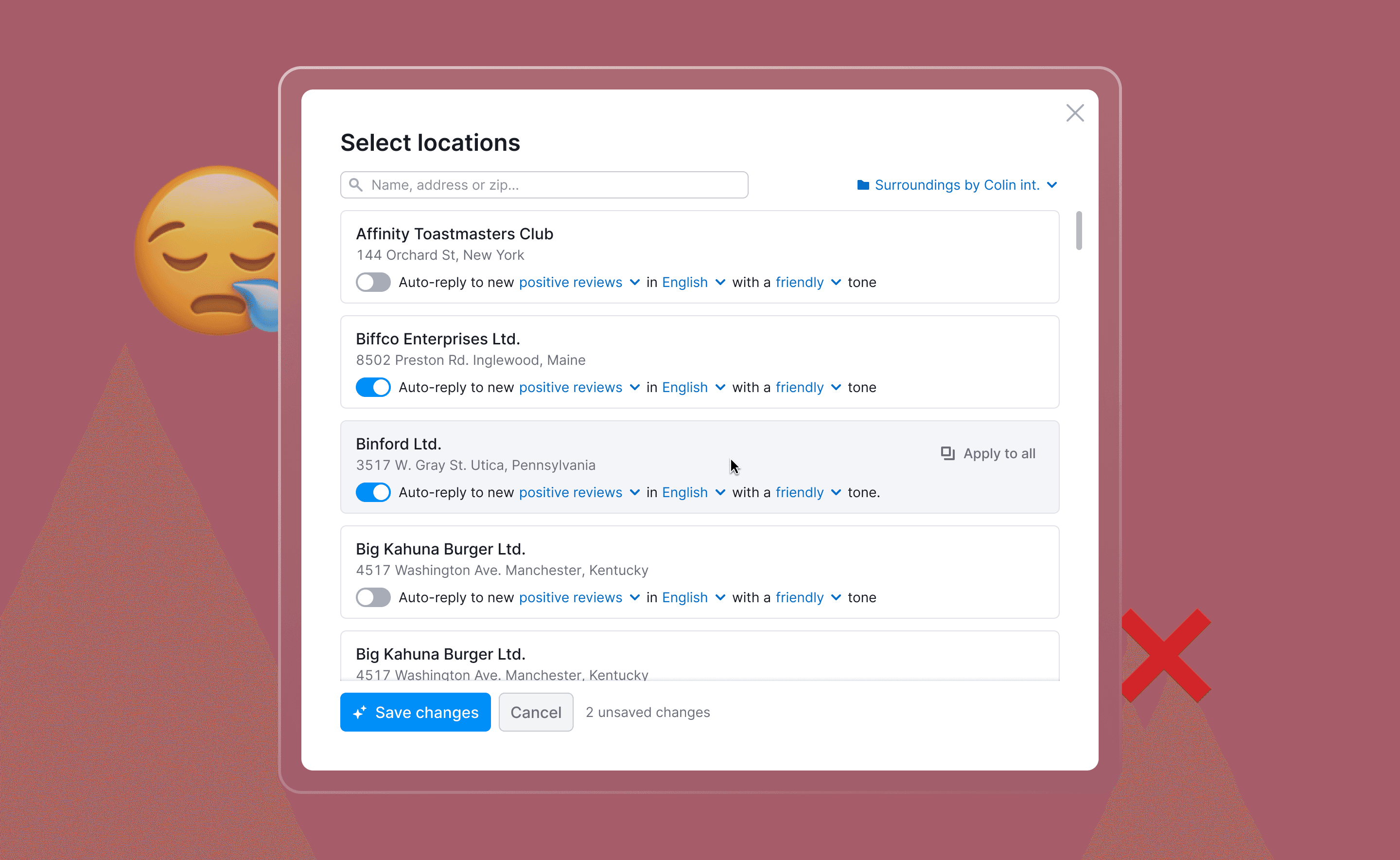
Bet that didn't pay off: multi-location settings ❌
We had a hypothesis 💡
Users with many locations want fine-grained control. Agencies and multi-brand operators would configure each location separately. Different tones, different languages, on for some, off for others. So we built it. A modal for per-location settings. About 1.5–2 sprints of focused work from design, eng, and QA.
Users barely used it.
In session replays, people tweaked one or two locations and bounced. Engagement metrics confirmed it: activated once in onboarding, never came back.
What I had gotten wrong 😑
I had designed for the user who should want control, not the one who showed up. Even our agencies didn't want to manage AI Replies location by location. They wanted to turn it on once and forget about it. Per-location controls broke that promise.
The principle my PM and I now apply: design the best single-location experience first; only consider multi-location as an extension if there's capacity and clear demand.
What this taught me about designing AI products
Trust to AI is built in steps, not activations 🪜
AI Drafts → AI Replies was the trust ladder pattern, and it generalizes. Whenever a user hands real authority to a model, a lower-stakes version of the same behavior should sit somewhere on the path before it.
Speed is sometimes a design liability 🤖
Models are fast. The product doesn't always benefit from that. Where AI acts on behalf of a human, "feels human" can be a stronger signal than "feels fast".
The prompt is part of the design surface 🎨
If a designer doesn't own qualitative review of model output, the UI is decorative. Owning the prompt loop is not optional for AI features.

Aftermath:
A feedback loop that spread
One small UI decision on AI Replies turned into something larger than the feature itself.
When a user turned AI Replies off, we showed a confirmation modal with an optional text field: Is there anything we could improve? It was the first such modal in the Local product, capturing the kind of feedback users give only when they're about to churn.
It worked. Users wrote, generously. The input went into a Slack channel and shaped our roadmap. Several v2 improvements came directly from these messages: tone customization, language picker, email summary.
The pattern spread. Other Local teams adopted it. Then the broader Semrush org. As of the last export I ran, the channel has captured 4,850 messages over 12 months, across the Local. It is now one of the team's most-cited inputs in roadmap discussions.
Live soon:
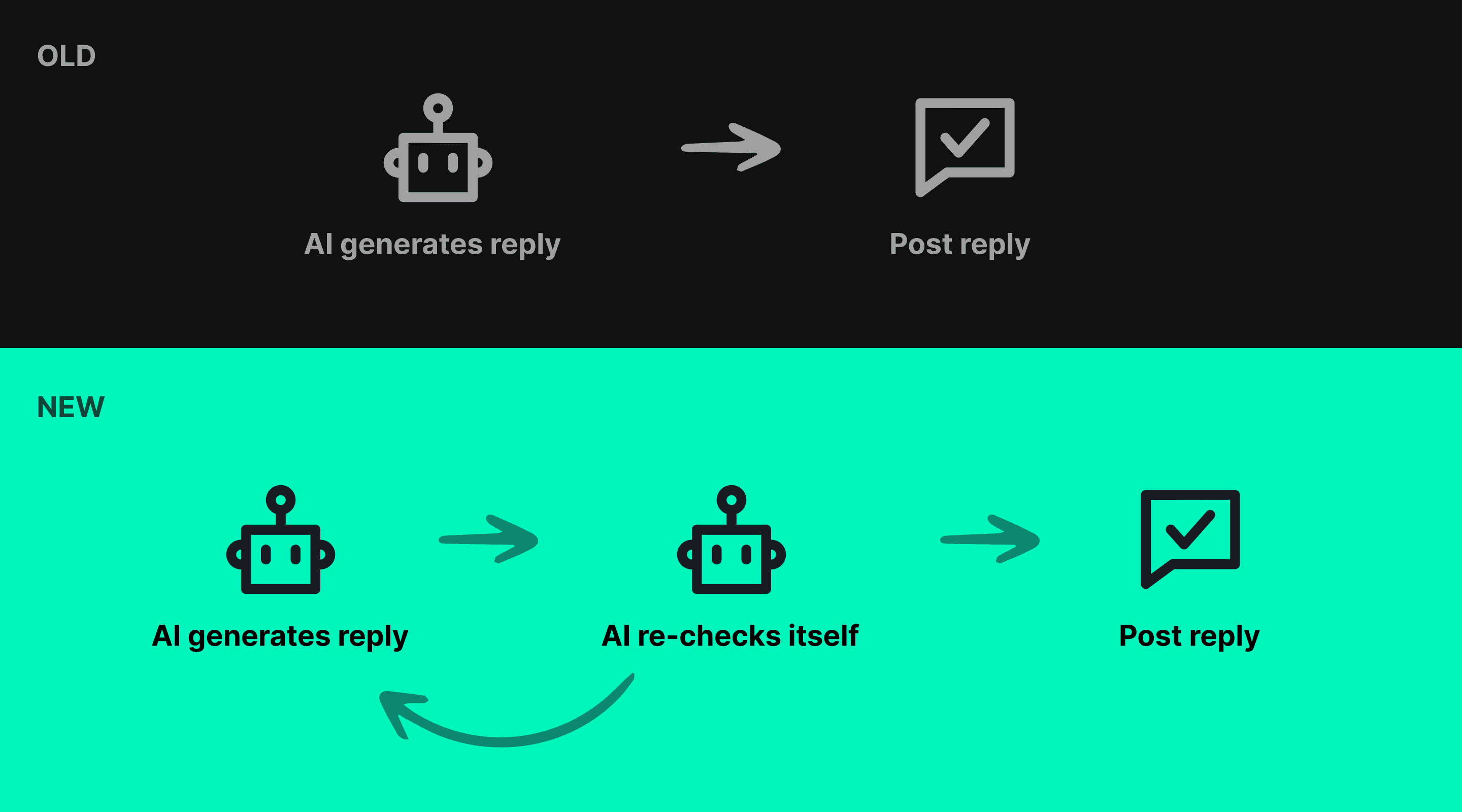
AI self-verification
Currently designing the next release: HIPAA-compliant AI Replies for healthcare locations. Shipping in two to three months.
The interesting design problem is reliability. A single-pass prompt, no matter how careful, can drift off-tone or miss a clinical edge case. The risk profile for healthcare doesn't tolerate "usually fine".
The pattern I came up with: a self-verification pass. The model generates a draft, then re-reads it against a separate verification prompt that checks for compliance and tone. If anything trips, it regenerates. Only outputs that pass go out.
Two passes are slower and more expensive than one. For regulated domains, the trade-off is the only one that works.
Other work on Local